


I have a terrible confession to make: my favorite font is Times New Roman.
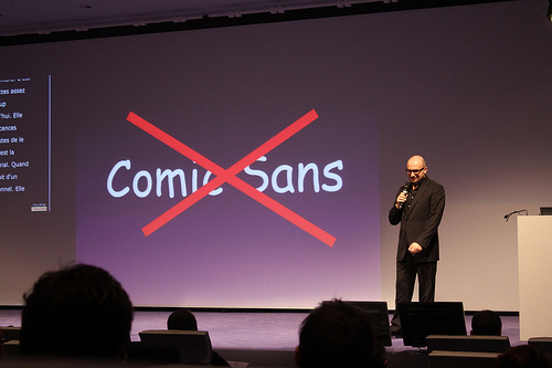
Due to my awful, bland taste in font, I find it impossible to judge anybody for their own font usage. Which is why I smile when I see people use Comic Sans. It isn’t even an ironic smile; it’s the smile of someone who wants everyone to be able to enjoy the art of words.
Simply put: Comic Sans is one of the most accommodating fonts for dyslexic students. While a lot of people might cringe at the rounded edges of the font, there are a number of subtle traits that makes comic sans special in the world of education. When reading is easy for you, after all, there is a lot that is often overlooked about the words we process on a day-to-day basis.
So today I want to direct everyone to this intriguing article by the creativemarket featuring Comic Sans and their thought-provoking discussion about its relationship with dyslexic students. It truly makes you wonder- what else is in front of you every day that you never even think about? How do other people see the same world as you differently, and how might that affect their educational needs?
photo credit: Sunfox Une slide pour faire plaisir à tout le monde dans la salle via photopin